Banking Onboarding
Live Website
Project File
Project Type
UX/UI Design
Timeline
1 day
Year
2024
Team
Individual project
Financial services often ask new users to complete long or confusing registration processes, which creates friction and leads to drop-offs.
Despite the availability of digital tools, there is still a gap for registration flows that balance security requirements with clarity and ease of use, especially in mobile contexts where people want to sign up quickly but still feel confident their data is safe.

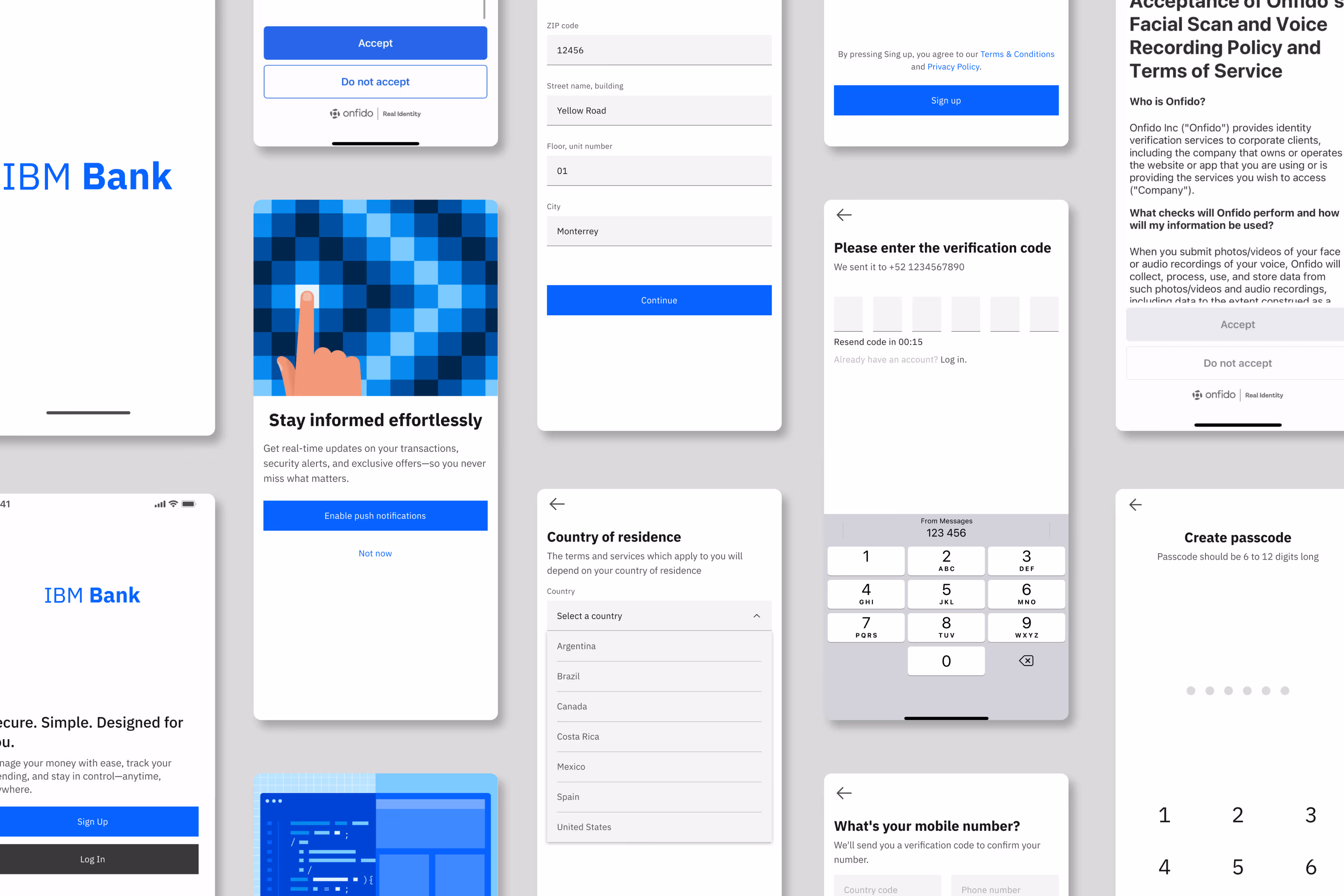
The challenge is to design a registration flow for a financial service that not only gathers the required information (name, email, password, identity validation) but also creates a trustworthy, simple, and user-centered experience.
The solution needs to align security and compliance with an accessible, modern design that encourages completion rather than abandonment.
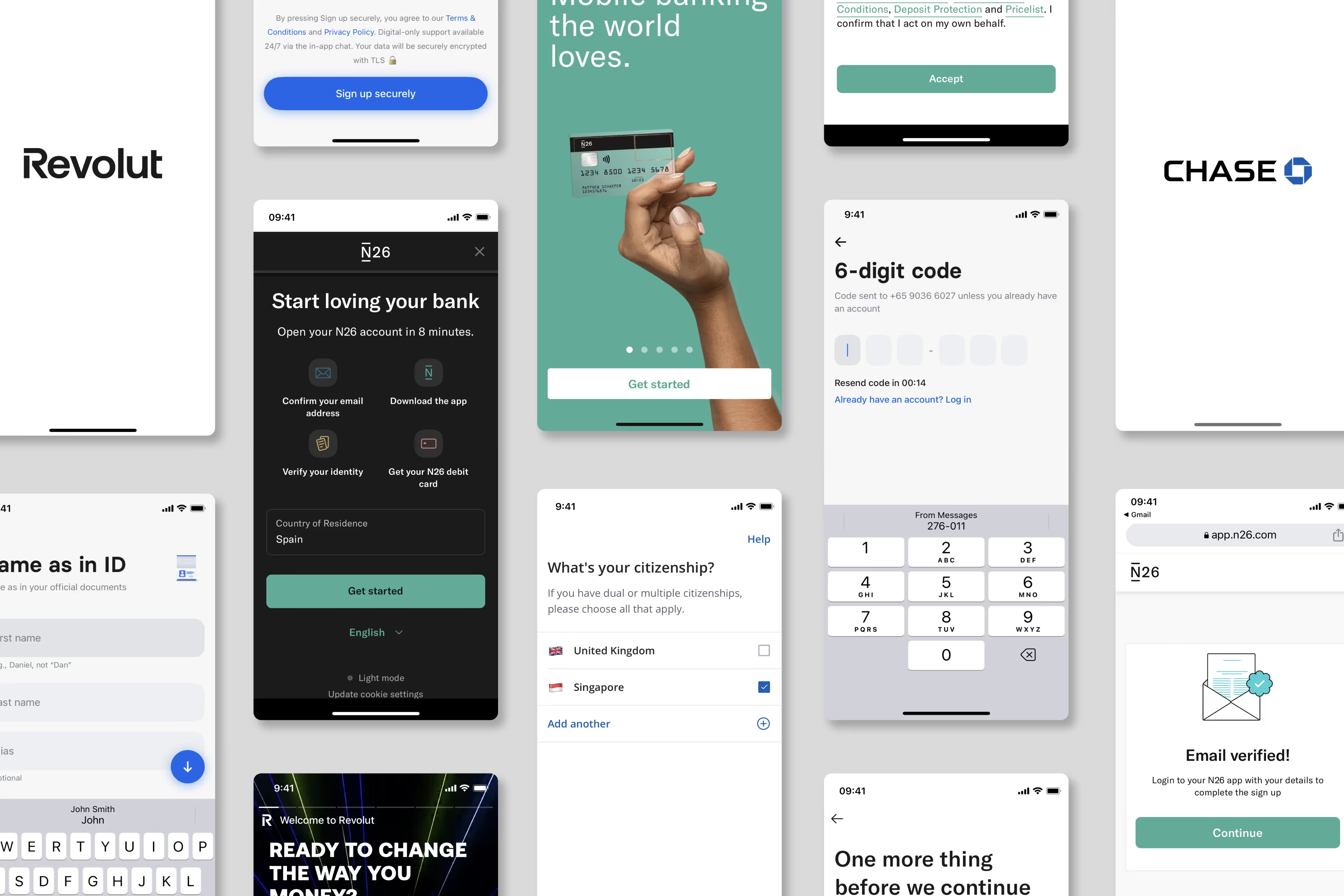
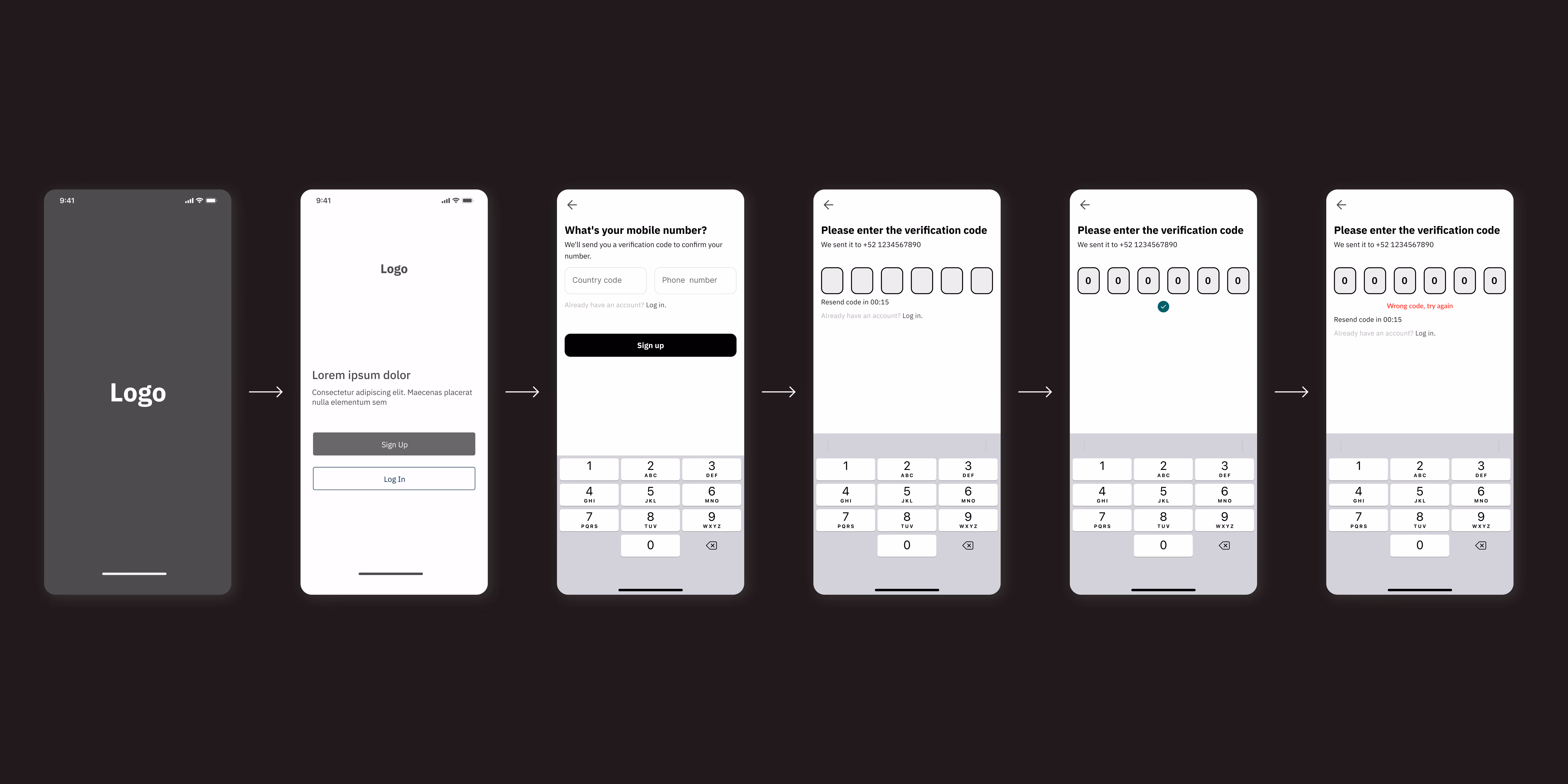
Benchmarking showed that many financial apps overload the first screen with fields; a progressive approach reduces drop-offs.
User expectations: People want to complete the entire registration flow within the same app. Being forced to switch channels (e.g., sending documents via email or completing steps on desktop) creates friction and can lead to abandonment.
Usability principle: Keeping visual hierarchy clean and consistent increases trust in financial contexts.
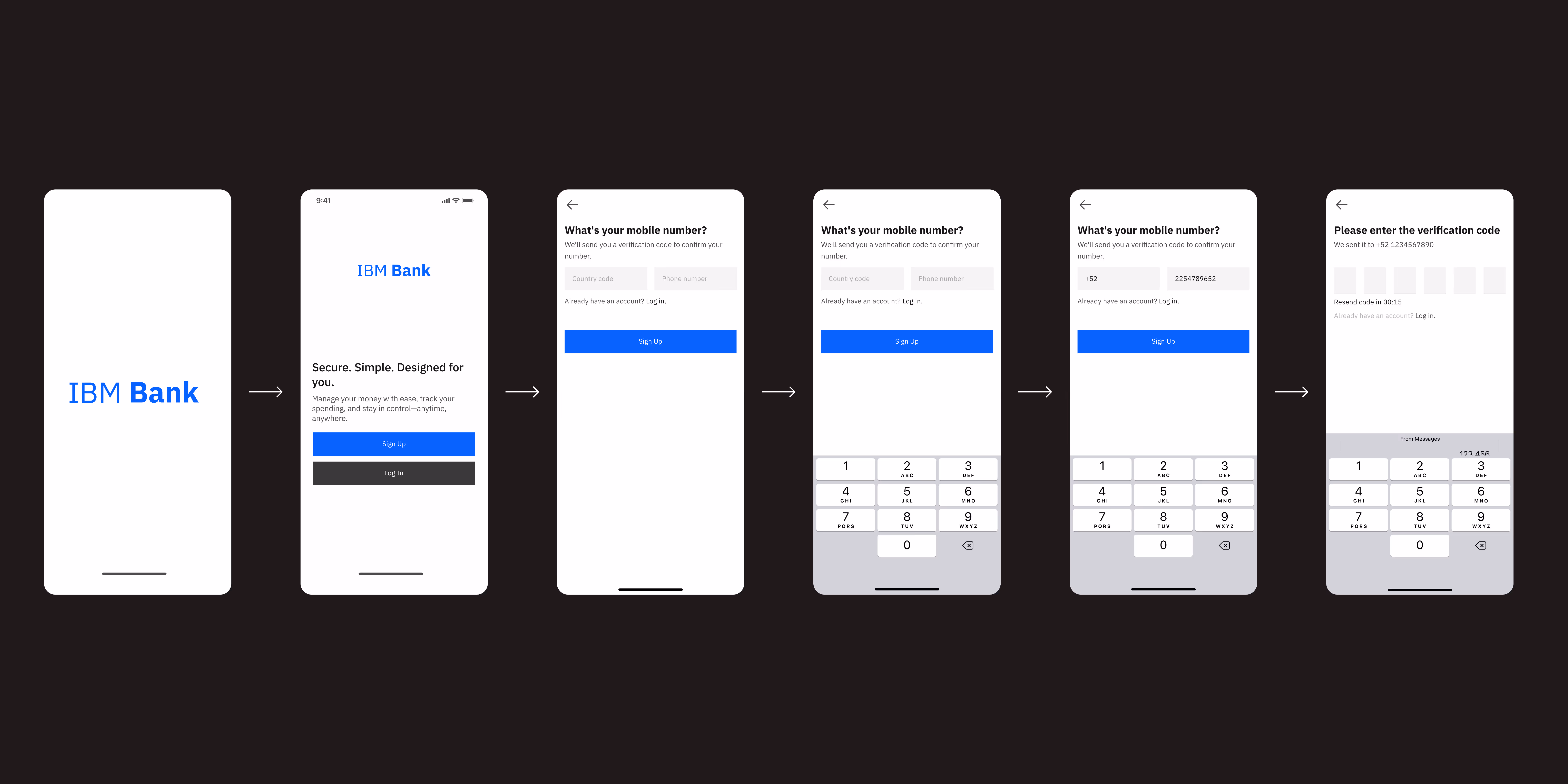
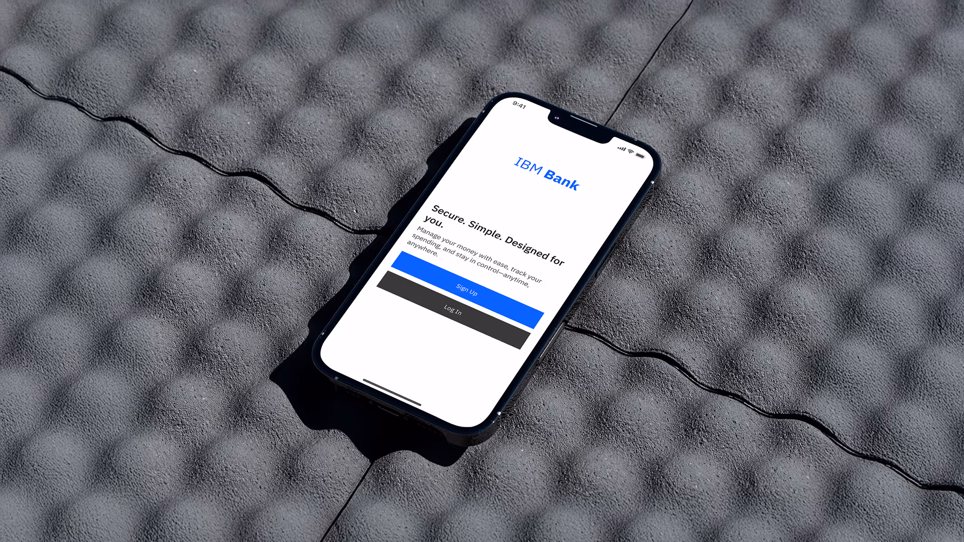
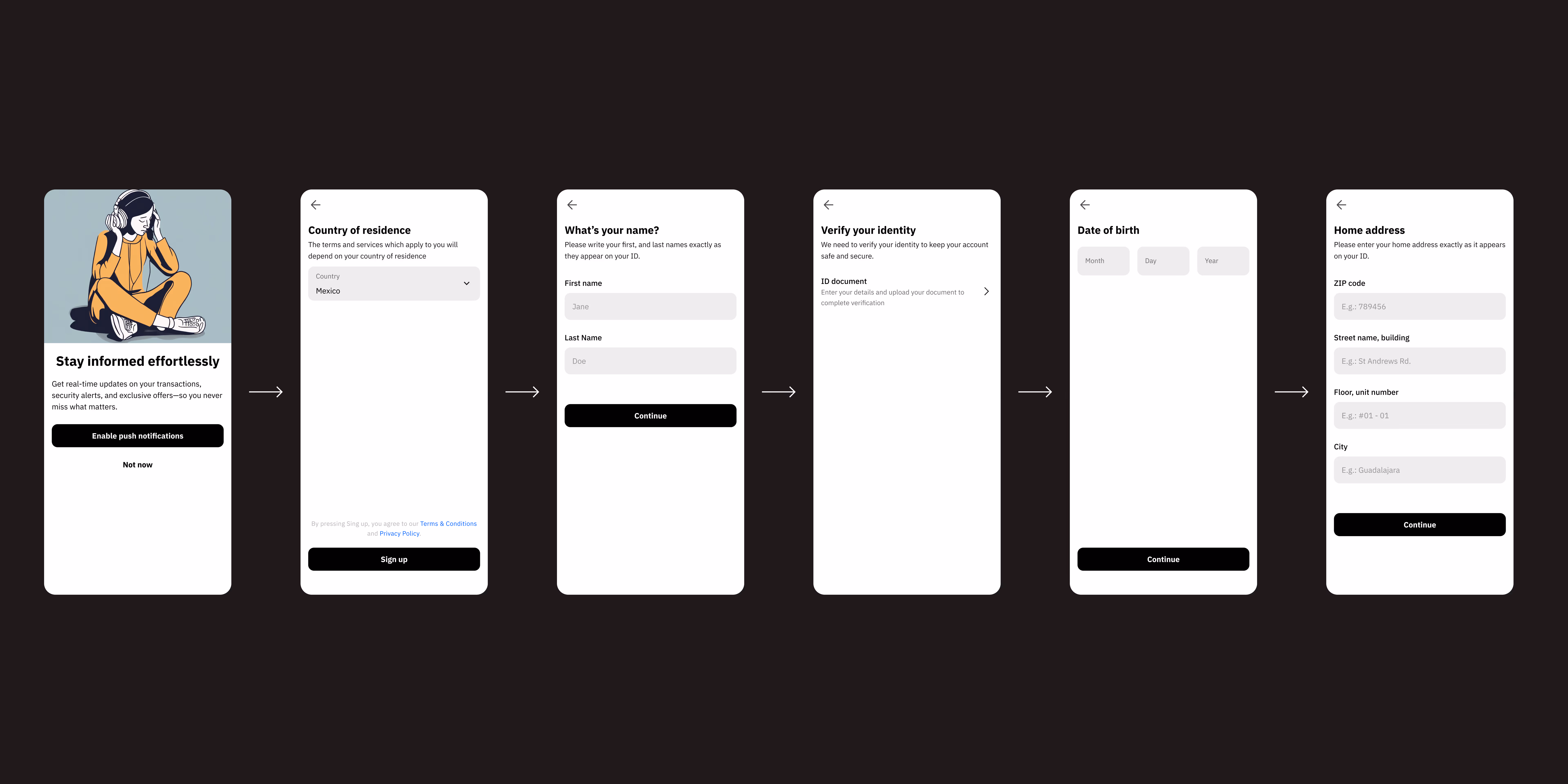
The registration flow was structured to keep users fully within the app, reducing abandonment risk.
Each step is streamlined, from entering basic details to verifying identity, with progressive disclosure, real-time validation, and clear error handling.
Document upload and selfie verification happen directly in-app, reinforced by trust-building microcopy and a consistent visual system that emphasizes clarity and security.