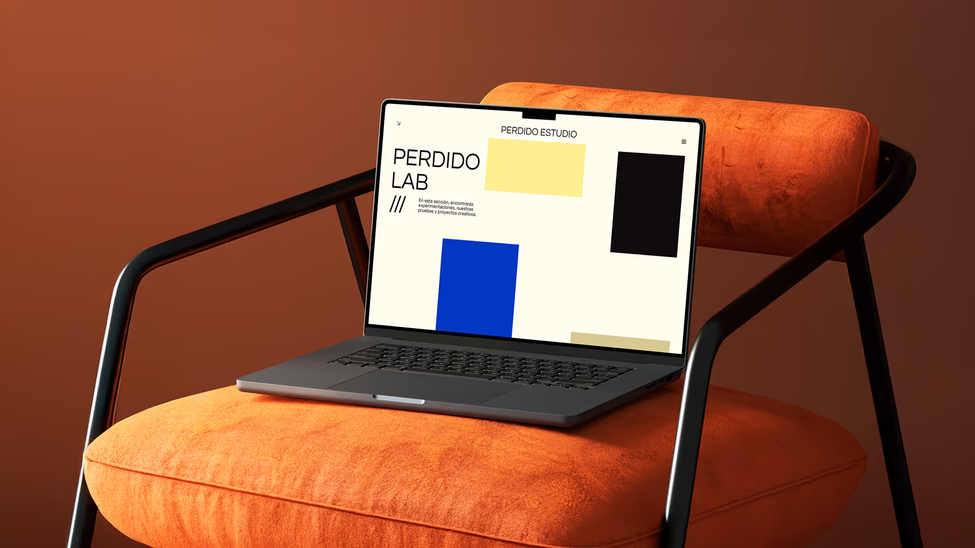

Even for creative studios with strong portfolios, many websites fail to clearly communicate services, brand identity, and personality in a way that feels as unique as the studio itself. Clients or visitors often leave confused about what the studio offers, how it works, or whether it’s the right fit.
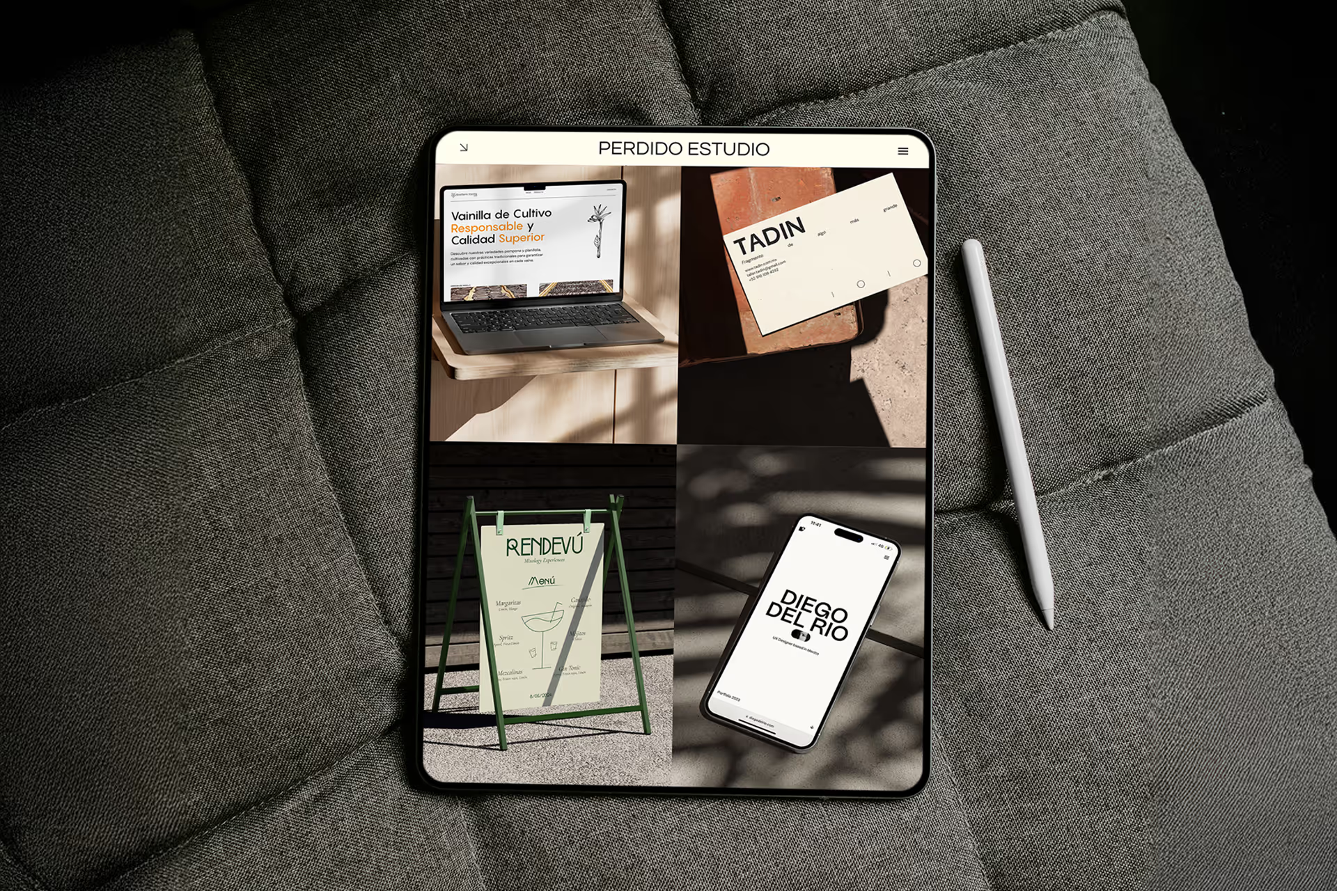

The challenge is to design a site for Perdido Estudio that not only showcases its identity, services, and visual creativity, but also builds trust, communicates clarity, and guides visitors naturally toward taking action (e.g. contact, view portfolio), all while remaining visually inspiring and aligned with the creative brand voice.
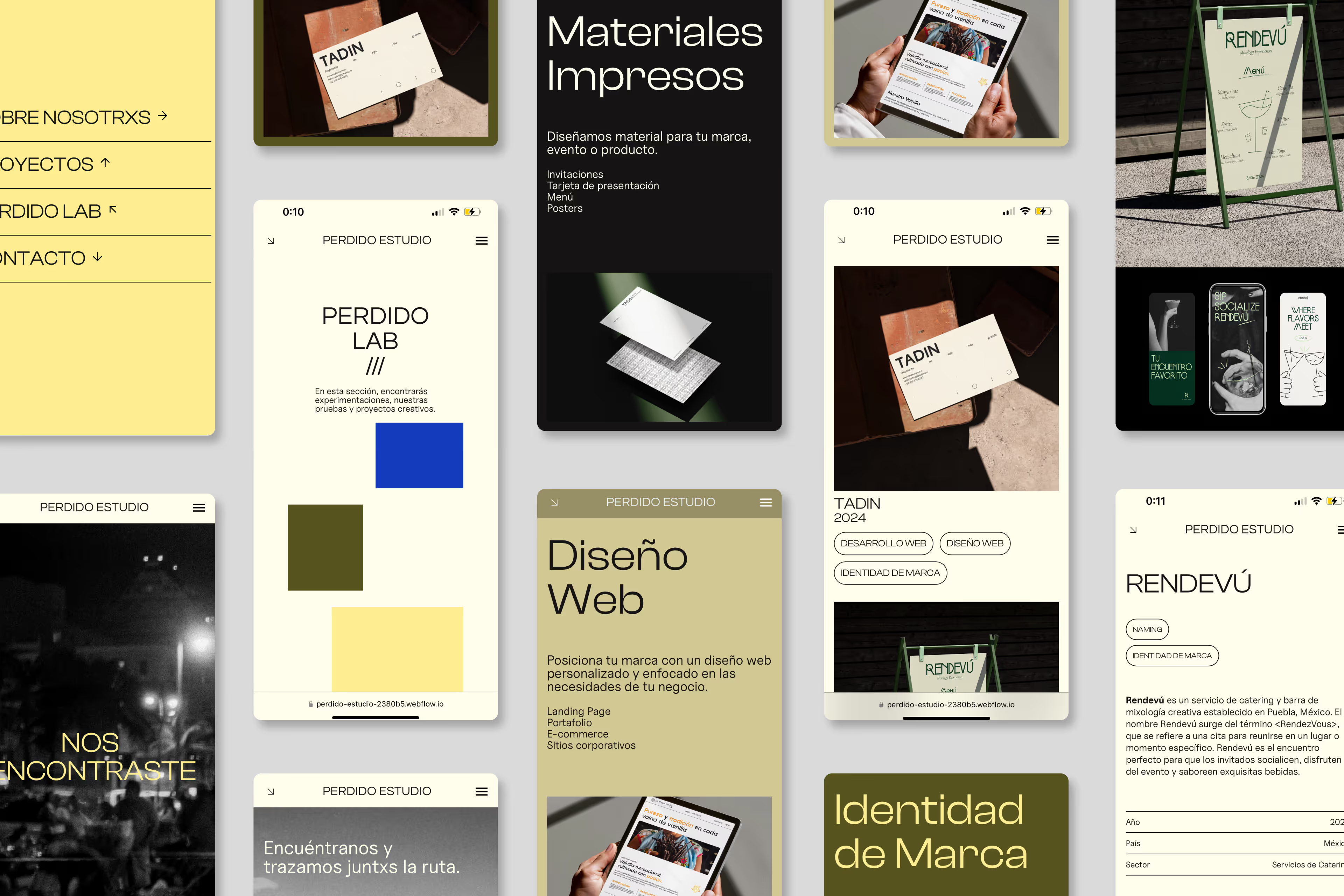
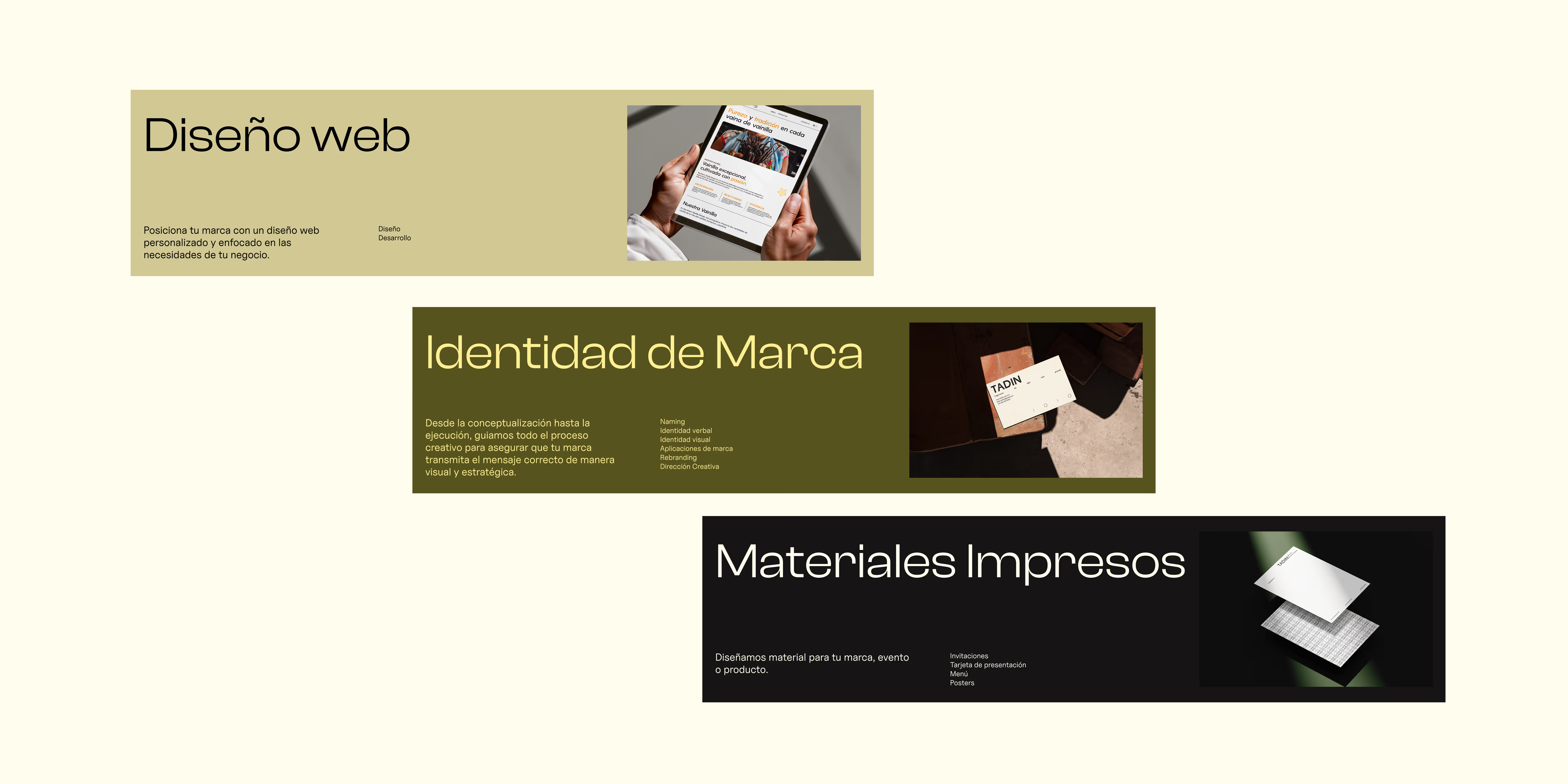
Visitors expect to see what a studio does (web design, identity, print materials, etc.) at a glance, and they want tangible examples of work that reflect quality and relevance.
The visual identity must be consistent across all service types (web, branding, print) so users feel coherence rather than disjointed offerings.
Users are more likely to engage if there is a clear call to contact, with confidence that their brand will be understood and well-represented.
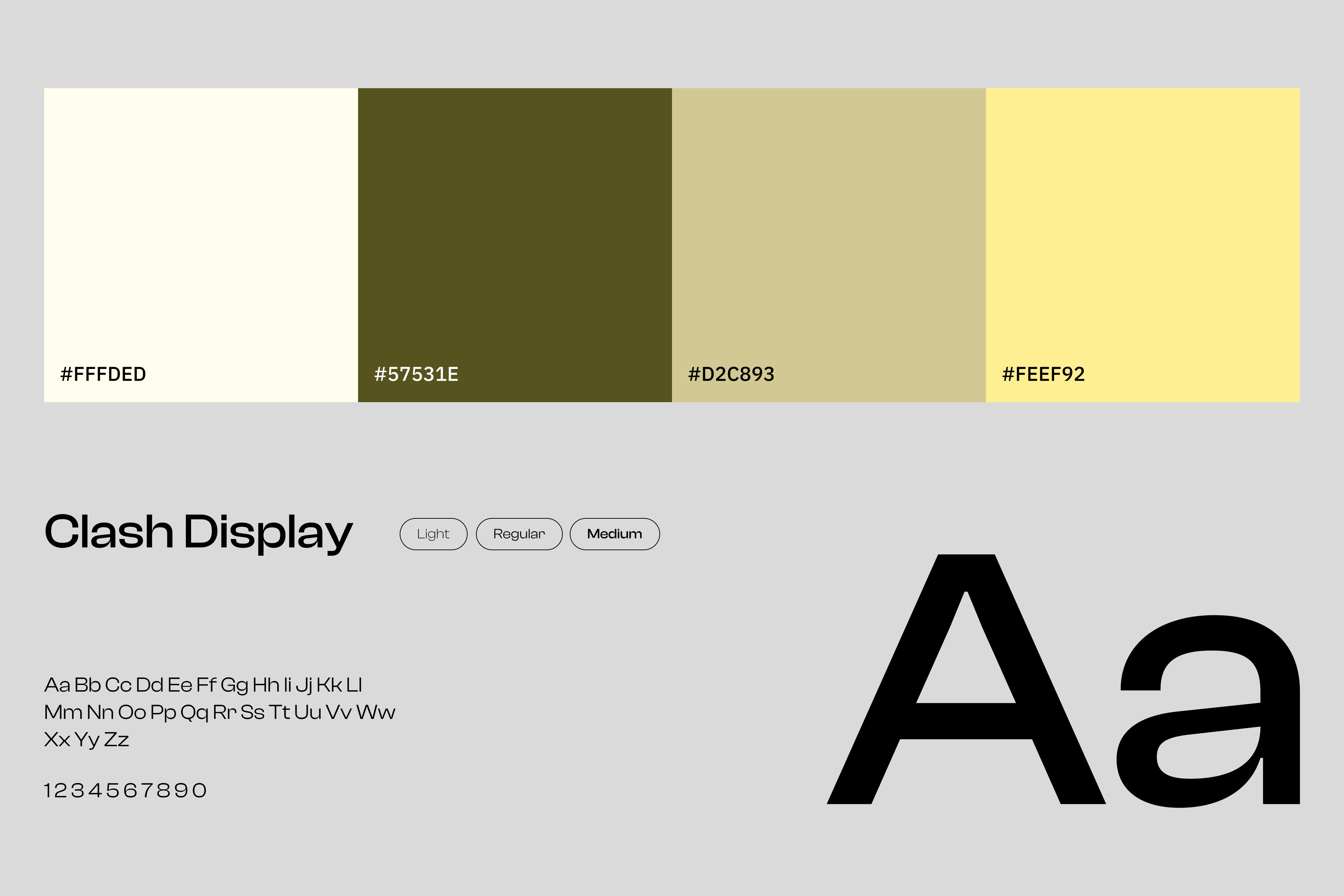
The website was designed to clearly present Perdido Estudio’s identity and services in a simple, structured layout. Content is organized into web, branding, and print offerings with a consistent visual system, while portfolio and contact actions are made easy to find.
The result is a site that feels creative yet professional, helping visitors quickly understand what the studio does and how to reach out.
